

By Ziad Khalife · July 6, 2026
Why Your Online Store Isn’t Converting (And How to Actually Fix It)
Traffic without sales on an online store almost always comes down to one of five fixable problems — cart abandonment and checkout friction chief among them. Here’s how to diagnose the real one before you touch a redesign.
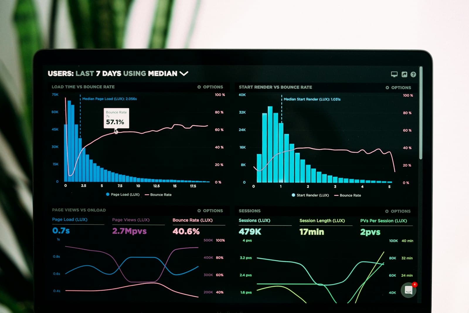
If your store gets visitors but not sales, the cause is almost always one of five things:
- An unclear reason to buy here instead of the next tab over — nothing that says why this store, this price, or this product beats the alternative a search away.
- Slow load times that lose people before a product page has even finished rendering.
- A checkout with more steps, fields, or surprises than it needs.
- Missing trust signals — no reviews, no real returns policy, no visible proof this is a business that ships what it sells.
- The wrong traffic entirely — visitors who were never going to buy no matter how good the store is.
Most stores that "aren’t converting" don’t have all five problems. They have one, and it’s usually not the one the business owner assumed. Fixing the wrong problem first — a full redesign when the real issue was page speed, new copy when the real issue was a broken checkout field — burns a budget and a quarter without moving the number that actually matters.
Start with the honest diagnosis, not another redesign
Before changing anything, look at where people actually leave. Analytics will show a specific step in the funnel — browse to cart, or cart to checkout, or checkout to confirmation — with a drop-off far worse than the rest. That step, not the homepage, is where the work should start. A checkout losing 80% of the carts that reach it is a much cheaper fix than a full rebuild, and it’s usually the actual source of a problem a business blamed on "the whole store."
The order matters: fix load speed and basic checkout usability first, because a slow or broken step makes every other test meaningless. Only once the fundamentals are solid does the deeper question — is this the right offer for this traffic — become worth investigating.
If you’re running this on Shopify specifically
Shopify isn’t the problem — an unaudited app stack usually is. A reviews app here, an upsell popup there, a currency converter fighting with both: each one adds its own script, its own font, its own load weight nobody revisits after install. Two years in, the store is loading far more than it needs to, and checkout still looks like the theme demo because nobody ever touched it past setup.
The fix isn’t always "switch platforms." It’s auditing what’s actually installed against what’s actually driving revenue, removing the rest, and treating checkout as a page worth designing — not the one screen every store leaves untouched. In our experience, this single pass resolves most Shopify conversion problems that get blamed on the platform itself.
The number that actually matters isn’t your conversion rate — it’s cart abandonment
Overall site conversion is a lagging, noisy number. Cart abandonment — visitors who add a product, then leave before paying — is where the real, fixable problem almost always lives, and it’s a different diagnosis than a store with no cart activity at all. The usual causes are specific and boring: shipping cost revealed for the first time at checkout, an account forced before purchase, too few payment methods for who’s actually shopping, or a mobile checkout that’s slower or clumsier than the browse experience that got them there.
Each of those has a direct fix — showing shipping cost earlier, offering guest checkout, adding the payment methods your actual customers use, cutting checkout to the fewest fields that still work. None of it requires a redesign; all of it requires actually watching where the specific carts get abandoned instead of guessing.
What the data says about where people actually leave
Independent research on this is unusually consistent: cart abandonment across e-commerce sits close to 70% industry-wide, so a store losing most carts at checkout isn’t necessarily broken — it may be roughly typical for an unoptimized funnel. That’s useful context, not an excuse. The gap between a typical store and a well-optimized one in the same category is usually a multiple, not a marginal improvement, and it comes from exactly the fixes above, not from generic "add more products" advice.
A ten-minute self-audit before you spend a dollar
Open the store on a phone, on real mobile data, not office wifi. Add a real product to cart and time how long checkout actually takes to feel usable. Go all the way through to the point right before you’d enter real payment details, the way a stranger would — no shortcuts, no already-knowing which fields to skip. Count the steps. Note every point where you had to think, hesitate, or dig for a shipping cost or a discount field. Each of those moments is a candidate for the real leak, and running this exercise honestly usually surfaces the actual problem faster than a week of guessing from a dashboard.
What "good" looks like, by page type
A homepage’s job is orientation, not persuasion — it should make it obvious within seconds what you sell and where to go next, then get out of the way. A collection page should make comparing and filtering products effortless, not bury it behind a single "shop all" grid. A product page needs the details a ready buyer is actually checking for — real photos, sizing or specs, shipping and returns — not a rehash of the homepage’s brand pitch. Treating all three like the same template, with the same generic layout, is a quiet cause of underperformance that never shows up as a single obvious bug.
The fix: a structured way forward, not a redesign for its own sake
Audit the funnel step by step, rank each drop-off by how much revenue it’s actually costing, fix the highest-impact step first, and measure before moving to the next one. This is slower than a full redesign but far more likely to actually move the number, because every change is tied to a real, observed leak rather than a guess about what "looks better."
When it’s worth calling in help
If the diagnosis points to something structural — checkout that needs to be rebuilt rather than re-copied, payment or shipping integrations the store never had, an app stack nobody can safely untangle without breaking something — that’s the point a conversation with a team that builds Shopify stores for a living pays for itself faster than another few months of guessing.
FAQ
Questions, answered.
- Why is my website getting traffic but no conversions?
- Almost always one of five things: an unclear value proposition visitors have to work to understand, slow load times that lose people before the page even renders, a confusing or multi-step path to the action you want them to take, missing trust signals (reviews, real contact info, credible proof of work), or traffic that is not actually your target audience in the first place. Fixing the wrong one first is the most common mistake — see the diagnostic order above.
- How do I fix low website conversions without a full redesign?
- Start with analytics, not opinions: find the single page with the highest traffic and the worst drop-off, fix that one thing, measure, then move to the next. Most conversion problems are fixed by removing friction from an existing page, not rebuilding it — a confusing form, a slow load, a call-to-action that is not obvious within the first screen.
- Why do B2B SaaS websites specifically struggle to convert?
- B2B SaaS sales cycles are longer and more considered than a typical purchase, so a website built like a consumer landing page — one CTA, one path, no room for a buyer who needs to loop in a colleague — loses people who are not ready to commit that day. The fix is usually offering more than one legitimate next step (a demo, a spec sheet, a lower-commitment trial) instead of funneling every visitor toward the same "Book a call" button.
- Is a WordPress website worse for conversions than a custom-built one?
- Not inherently — but WordPress sites accumulate conversion problems faster in practice. Page builders and plugin stacks add load-time weight most site owners never audit, template layouts bury the actual call to action below unrelated widgets, and nobody revisits the original setup as the business changes. The platform is not the cause; an unmaintained, plugin-heavy build on that platform usually is.
Keep reading
Related to what we do.
- Explore
Storefronts & Checkout
Conversion-focused stores that are just as easy to buy from on a phone as a laptop.
- Explore
Payments & Fulfillment
The checkout and payment details customers never think about, working exactly as expected.
- Explore
How to Build a Shopify Store That Actually Looks Like a Brand
The specific decisions that separate a custom-feeling store from a templated one.
Have a project in mind? Let’s talk about it.
Tell us what you're building. We'll come back with a real plan and a straight timeline, not a pitch deck.